A Home to Grow Old In- Aging in Place

1 in 3 adults over 65 fall each year and only 1/3 fully recover, and 55% of fall injuries occur inside the home.  Additionally, 1 in 5 Americans needs help seeing, hearing, walking, using stairs, lifting and carrying objects.  Perhaps this email has already bored you to tears because equipping your home to be universally accessible is the furthest thing from your mind (and honestly it’s just not a very titillating topic), but you might consider making your space a more “visitable design,” (or preparing for the off chance someone in your household suffers a broken leg).

My first recommendation is- don’t be the 1!!  But in all seriousness, if you can plan for a Universally Designed home you will never regret it, and you will have a home to gracefully “age-in-place” because you’re likely amongst the 80% of us who want to stay where they are as they age, so longevity is something to think about.

Three Key Features that are essential to the accessible home follow:

  1. At least one entrance with zero steps.
  2. At least 32 inches of clear passage through all interior doors, including bathrooms.
  3. At least a half bath on the main floor that is accessible, and when space allows, a full bath.

Let’s dive a little deeper into each principle, bearing in mind,should the need arises there are tons more recommendations and standards to equip a home at www.ada.gov and www.aging.ca.gov.

Entries and Doors

Exterior Entryway: Build a very gradual ramp designed to seamlessly thread through the landscape (it should not look like a ramp).  If this cant be achieved in front of the house consider modifying the back entry or including a garage entry option- instead of steps, install an actual ramp inside.

Interior EntrywaysRemember the wider the better!  The minimum clearance to remember is 32”, it’s not just good for wheelchairs and walkers, it’s better for strollers, furniture delivery and unmarked walls and moldings.

Doors: A minimum clearance of 32” requires 34-36” rough opening at doors (you lose inches when trim is applied).

Hardware: Lever handles are always easier for gripping and turning (particularly for those with arthritis) or go the touchless route.

Pocket doors or barn doors with long bar hinges to open and close are nice options where space is limited.

Going Potty

Toilet: Consider equipping the W.C. with “Comfort Height” toilets, or a wall hung toilets (to gain more space).  I’m not a personal fan of raising the height of the toilet seat (Squatty Potty anyone?) but for those facing knee or back issues an extra 2”-4” can really make a difference.

Vanities:  If needed, consider shallow sinks or vessel sinks so knees can go underneath.

Shower: A very attractive wet room can double as a fully accessible bathroom.  Make sure the whole room is tiled so it’s completely safe from any water, you need a slightly sloped floor with trench drains.
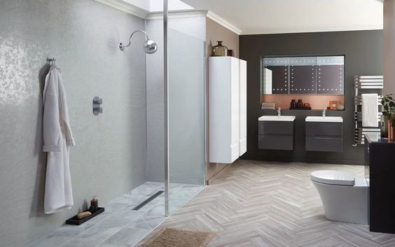
Bath: Kohler makes a rising wall bathtub if transferring from a wheelchair ever becomes necessary.

Grab Bars: Whether you need them or not grab bars are often handy, and they now come in array of styles and finishes (don’t pick ugly ones!).  If you’re in the renovation/building stage consider them for the future and even if you are leaving them off the wall, have your contractor add extra blocking within the walls for secure anchoring later (never use a suction grab bars).

Flooring: No polished stone on the bathroom floor, opt for a honed finish and lots of grout.

On to the Kitchen

Countertop: If still in the planning & building mode, consider adjusting a portion of the countertop to a lower height in both the kitchen and the bathroom.  Generous counter space is essential.

Built-ins: Reduce cabinets and include lots of drawers, they’re much easier to operate and leave one hand free.  Lower the dishes down into reachable drawers.

Refrigerator/Freezer– Drawers can be built-in to the island or perimeter cabinetry.

Aisle: Widen walkways between island and perimeter cabinetry

Cooktop: Lower the oven to a reachable height.

Upgrade: There is a plethora of useful modifications to make to our existing kitchens look at Hafele and Rev-a-Shelf for inspiration and ideas.

Lighting

It is oh-so-important to see, and it’s also harder as one ages.  Adequate lighting is essential, and proper lighting may also save you from trips and falls! 

Make sure to sufficiently light stairwells and all key risk areas.

LED strip lighting can assist with visual cues in walkways and down hallways.  There are great in-floor options that can be incorporated and don’t look like airplane aisles.

Leaving a light on for the midnight bathroom run is always a wise idea.  Choose blue lighting as it doesn’t interrupt sleep patterns.

Other Trip Hazards

Eliminate trip hazards– Throw rugs are a big cause of falls- tape them down or take them out.  Another option is to embed into wood floor well.

Make sure there are no cords!

Flatten thresholds between rooms.

Choose low pile rugs.

Fix uneven or cracked surfaces in driveways and remember unexpected water on the floor is an enemy.

To sum up- Universal Design refers to a home that is accessible to all, and one that is designed to age-in-place.  If you’d like to know more about incorporating Universal Design into your home call me for a consultation.  Here is another handy resource and again don’t be the 1!

www.stopfalls.org  – Fall Prevention

Stay safe out there!

Window Treatments- A Worthy Splurge!

Some windows are commanding enough to stand alone, but most need window treatments for privacy, light diffusion, and the added softness it lends to the interior.

Costs are often a concern and rightly so, as window treatments, like most home improvements run the gamut!  For a 36” wide window you can look to a $200-$600 range, for more custom treatments $600-$1,200.  With windows larger than 36” wide and customized to make a statement, you can estimate between $1,200-$3,000 per window!  Still, in most cases, window treatments are a worthy splurge!

It can be exhausting trying to choose from an endless array of materials, fabrics, and styles.  It can also be confusing trying to envision treatment for small, tall or oddly shaped windows.  Here are the broad strokes of one of the most intimidating interior design subjects.

First step when determining the design, is to consider how the windows need to function.  Does the room have ample light?  Does it need air?  Will the window be opened?  Is there a nice view?  Is outside noise a problem?  What direction does it face?  If South & West- do you need to reduce heat gain & glare, if North & East- do you need to reduce heat loss?  Do you need complete privacy or darkness?

After you’ve answered the basic questions measure the windows or have a professional window installer measure for you.  Fabric gets expensive so you want to make sure you order the absolute least amount you need to achieve the desired fullness effect.  After this all-important step you can move on to the fun stuff.

Drapery/Curtains

If you have taller and larger doors and windows, drapery is often the best solution.  You can decide whether to treat a bank of windows as a single entity or to individually treat them.

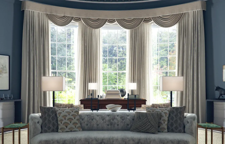
(Does anyone else immediately picture the resplendent drapery of the Oval Office when thinking about window treatments?  Here, as to not be controversial, is a photo of Claire Underwood’s Oval Office, plus it’s the prettiest in my humble opinion.)

(Image: Modsy)

Hardware

Where possible drapery hardware should extend 4”-8” beyond the window casing.  The wider the window treatment the larger the window will appear and the more impact the window treatments will have.

Similarly consider mounting the hardware as high as possible, especially in a low ceiling room and when you have smaller windows, to create maximum impact.

Traversing versus Stationery- this is fairly obvious- traversing moves, stationery stays put.

If you choose traversing and have especially large rods with many rings and brackets, it’s a good idea to invest in actual traversing hardware.  The carriers are built-into the drapery hardware, and it tends to be less clunky on the window.  If it’s a standard size window regular rings and brackets work well.

Height & Width

For the fabric width it’s best to estimate about 1.5 – 2x’s the width of the window for the right fabric fullness. Quantity needed will depend on the pleat style as well as the return (back to the wall).

Floor Length refers to kissing the floor (1/2” of fabric on floor), and this works well particularly for traversing drapes.  (It’s a nice middle ground between “geeky flood pants,” and dust mop.)  Trouser Break is about 1”-2” on the floor, and that works well for stationery drapes.  Puddle Length is not quite as popular, 6”-12” resting on the floor, but adds lots of drama to living and dining rooms.


Fabric

The best fabrics to choose for drapery are cotton, linen and occasionally synthetics.  Silk works in a North facing window but must be lined.  Wool works as well but should also avoid Southern exposure.  Most fabrics are generally okay to use for window treatments, but you’ll almost always want to get the fabric lined to protect the material from solar rays, dirt and condensation.  This also adds insulation.  Blackout liners are great for nurseries and bedrooms.  If diffusing light or letting the breeze blow is a priority you can skip the lining. 

Shades

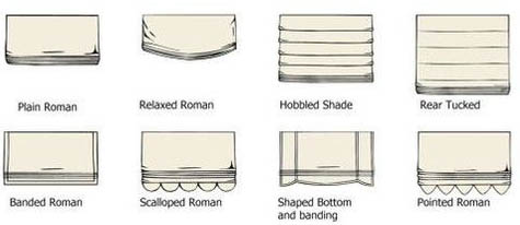
Shades tend to cost less than drapery, and there are tons of great options to suit most styles.  From simple roller or solar shades, to honeycomb shades, to beautiful wovens and Roman shades, these options work best to create simple, modern luxury.  Woven natural materials add a lot of warmth to the room.  Roman shades add a tailored look and you have limitless options in terms of fabric pattern.

Inside or Outside Mounts

Inside is the cleanest look and it allows moldings to show.  If you want to hide ugly or non-existing molding outside mount is the best route.  This also serves to make the window appear larger and grants the most privacy.

If you’re going to really splurge on window treatments it seems the best place to plunk down is a formal dining room, living room or a bedroom.  If you want to add drama to the space, soften the room and invite celebration, this all can be accomplished by adding drapery.  To keep it tidy, and more modern, shades are the way to go.

There is loads to think about when it comes to window treatments.  We’ve only scratched the surface here (haven’t even gotten into gussying up with passementerie, cords, tassels gimps and fringes!) but perhaps you now have a bit more confidence to start really considering that pretty valance or café curtain over the kitchen sink or adding some dramatic drapery to your bedroom.

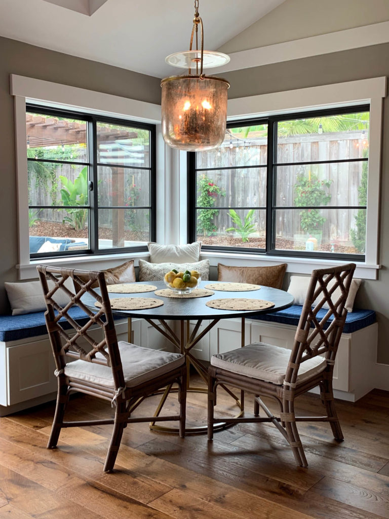
Take our breakfast nook- the windows and trim are attractive enough but when the blinding mid-afternoon Southern sun comes blasting through it is just begging for some slouchy Roman shades!

Window Treatments need not be an intimidating endeavor, call me to set up a consultation and we can get into the nitty gritty!